

🖥️ 💻 📱
Hey folks, 🙇♂️welcome to the new article on CSS media queries. With the help of this article, you become able to understand what is Media Queries, How it works, why we use them and so many things. So let's get started🙂.
📍What are Media Queries in CSS?
Media queries are the CSS technique that allows applying CSS style to depend upon the character of the screen.
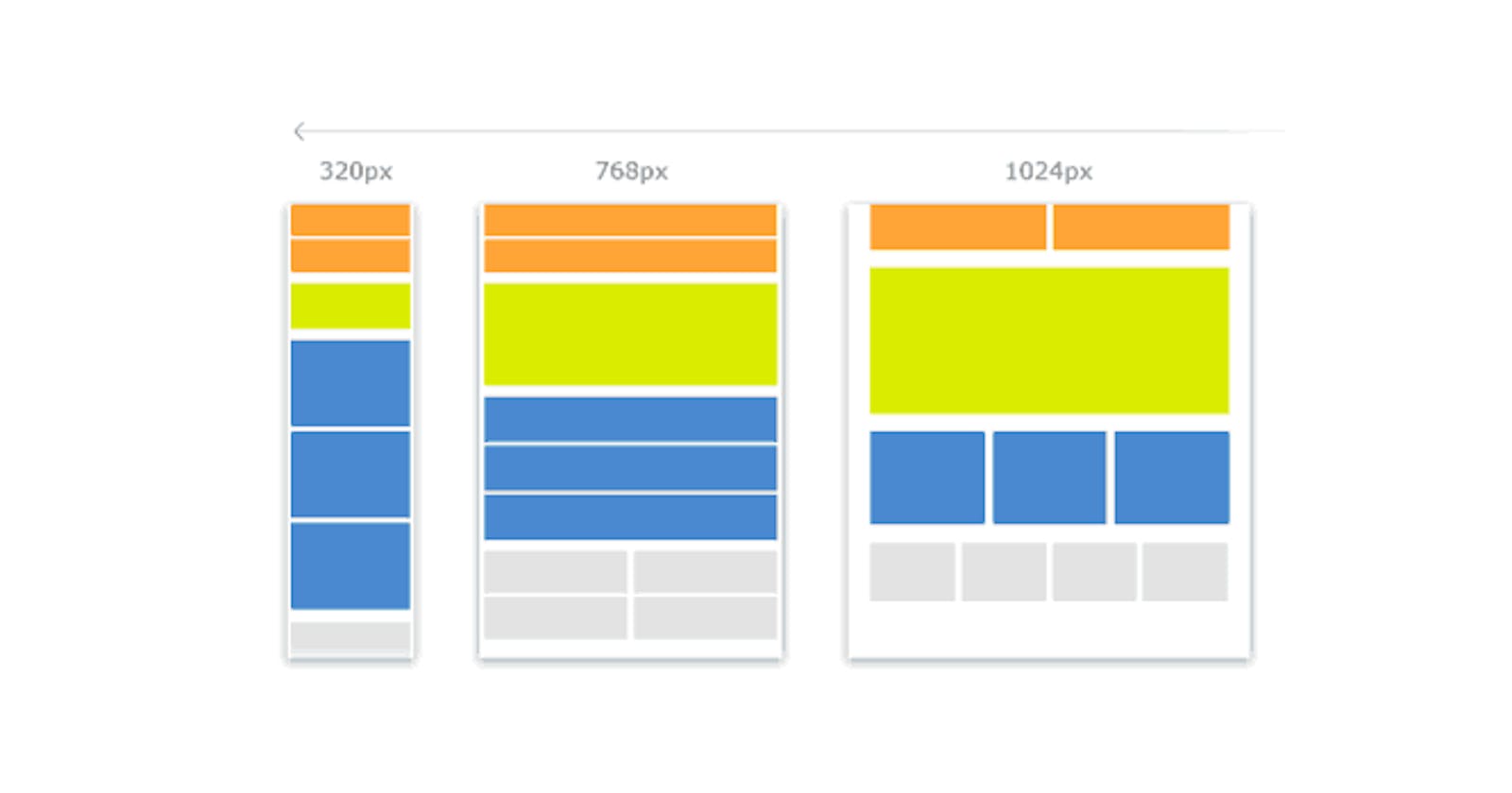
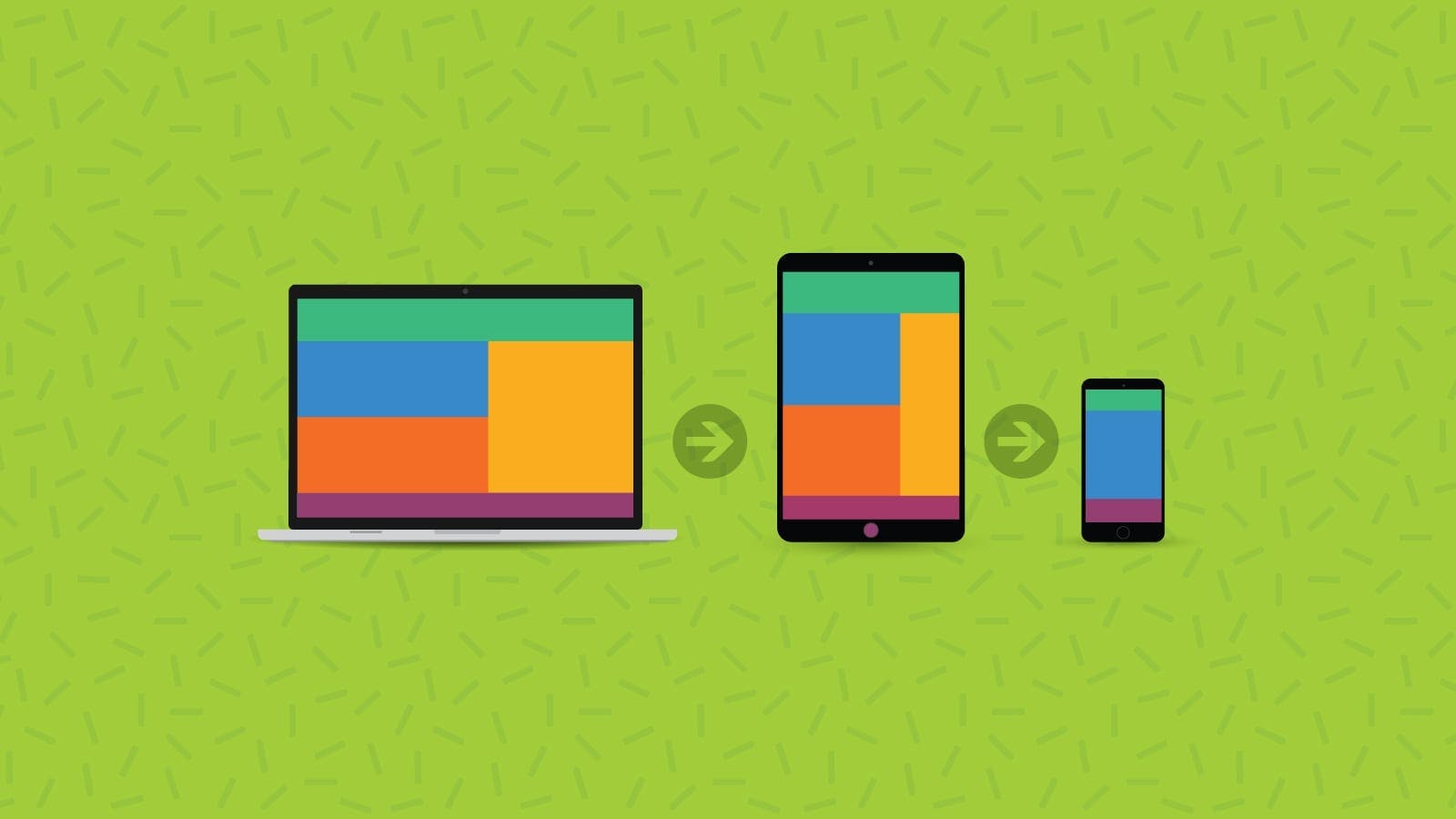
In other words, media queries are the technique that helps us to make any web pages or websites responsive. The word responsive means, in general, we use different types of machines in daily life like Desktop, Laptop, Tablets and Mobile phones and these machines have different types of viewports. By using media queries we make the web pages as much as responsive based on the viewport character of machines, which means the web pages become a proper fit on each viewport.
Syntax of media queries.
@media media-type and(media feature rules)
{
   /*  CSS rules which you want.   */
}
Example:
let's suppose when you want to make the display background color green when the max-width of the display became 800px.
@media only screen and (max-width:800px)
{
  body{
         background:green;
      }
}
📍How do media queries work?
Media queries work by testing the device's characteristics against a set of predefined conditions. If the device meets the conditions specified in the media query, the styles defined in the media query are applied. If the device does not meet the conditions specified in the media query, the default styles are applied.
Media queries work by using the @media rule in CSS. The @media rule is used to define a set of styles that should be applied to a web page based on the device's characteristics. The @media rule is followed by a set of conditions that must be met for the styles to be applied. The conditions are defined using media features.
Media features are predefined characteristics that can be tested using media queries. Some of the most common media features include min-width, max-width,orientation, and resolution. The min-widht and max-widht media features are used to test the device's screen size, while the orientation media feature is used to test the device's orientation (portrait or landscape). The resolution media feature is used to test the device's screen resolution.
📍Types of media queries
Generally there are two typs of media queries
And
Only
1). And : The and media query is the most common and is used to apply styles to devices that meet multiple conditions.
2). Only: The only media query is used to apply styles to devices.
Example:
@media only screen and (max-width:800px)
{
  body{
         background:green;  /* or any css properties */
      }
}
📍Device break point in media queries
These are used to mention the device minimum and maximum width on which you want to apply the CSS styling.
min-width: 600px; This property is used to give the minimum width from where the given styling should start applying. Only from this width the given styling will be applied.
@media (min-width: 765px) {
             .container{
                            /* css styles */
                       }
}
max-width: 900px; This property is used to give the maximum width up to where the given styling should be applied. After crossing the range then all of the styling mentioned in this query will be removed.
@media (max-width: 1140px) {
        .container{
                     /* css styles */
                  }
            }
We can use both properties using conditional operators to target the particular size. an example is provided below.
@media (min-width: 570px) and (max-width: 750px)  {
        .container{
                       /* css styles */
                  }
           }
Thank you :)