

🎀WELCOME TO MY BLOG🎀
Hey, folks I hope you are doing well😊. let me introduce you to the BOX model of CSS and CSS Flexbox. This article is going to familiarise you with the BOX model of CSS and FLexbox of CSS. After reading this article you got some idea about all these things. This is my small effort. I hope you like it😇.
So, let's begin with The BOX model of CSS.
🔶 What is Box Model in CSS?
Understanding of Box model in CSS is very important when we talk about the layouts of any page. The Box model gives the right understanding of page layouts to set Margins, Padding, Border, and Contents.
We can say that the Box model is used to create the design and layouts of any page.
let us take an example with an image so that you can understand it properly.
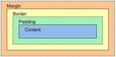
Now in the picture, we can see clearly how the layout is given to any page. where the margin is to take place. where and how the border & padding is to be set and last how much space the content should be taken.
The main properties of the Box model are given below :
📍Margin: This property is used to create space around the element.
📍Padding: This is used to create space around the element.
📍Border: This property is used to cover the content.
📍Content: The content is used to display all the text and images.
Now we have a basic understanding that what is the Box model of CSS and now we are going to move into the depth of the Box model of CSS.
🟣 Setting height and width :
we can set height and width in CSS individually.
#box { //using id selector.
height: 20px;
width: 40px;
}
🟣 Setting Margin and Padding :
we can set the margin and padding as follows.
.box { //using class selector
margin: 3px;
padding: 10px;
// sets top, bottom, left, and right values.
}
we can also set the margin and padding individually like this :
margin-top: 40px;
margin-bottom:20px;
margin-left: 10px;
margin-right: 39px;
The same goes for padding.
🟣 Setting Borders:
we can set the border as follows.
.box { // using the class selector.
border-width: 4px;
border-style: solid;4
border-color: black;
}
we can set border-radius also to create a rounded border.
i.e: border-radius: 6px;
now we have done with the basics of the box model and we have a basic understanding of the box model.😎
🎯 We are going to learn the CSS Flexbox now. In this part, we are going to learn what is flexbox, what are flex-direction properties, properties on flex items and many things.
so let's begin with
🔶What is Flexbox in CSS?
The flexbox is a property of CSS that provides a way to make the page layouts more efficient.
In another word, we can say that the main aim of Flexbox is providing a better way to layouts, align and distribute space among items in a container.
initialization of Flexbox with the help of an image is shown below.
  //
  .container{
               display: flex;
            }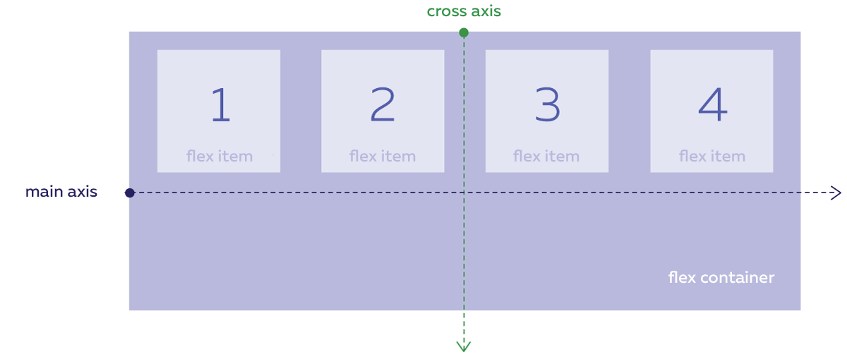
In this picture when we give the properties of display flex all the items became flex. The flex property enables all the flexbox properties. The selected element becomes a flex container Its child contents become flex items It will algorithmically layout its contents.
🔶Flex-direction Properties :
The flex-direction property defines the direction towards which items are laid can be row, row-reverse, column, or column-reverse.
By default, the value of flex-direction is row.
let's take an example with code that you can understand properly.
🟣flex-direction: row;
flex-direction is row by default in Flex-box.
let's take an example:
🟣flex-direction: column;
when we want it in the column we have to give the flex-direction: column.
let's take an example:
🟣flex-direction: row-reverse;
By using the row-reverse property the content will start from the main end in the opposite direction.
let's take an example:
🟣flex-direction: column-reverse;
By using the column-reverse property the content will start from the bottom main end in the opposite direction.
let's take an example:
🔶Flex properties for Parant( Flex Container).
There are the following properties for flex parent.
🟣Flex-wrap:
The CSS flex-wrap property is used to specify whether flex items are forced into a single line or wrapped onto multiple lines. It can be a wrap,no-wrap,wrap-reverse, or wrap-items as needed with these properties. By default it is no-wrap.
let's take an example:
🟣Justify-content:
It defines alignment along the main axis, or we can say that the justify-content property in CSS is used to describe the alignment of the flexible box container.
justify content holds many properties
justify-content: flex-start (items aligned from the start of flex-direction.)
justify-content: flex-end (items aligned from the end of flex-direction.)
justify-content: center (items are centered in the horizontal axis .)
justify-content: space-around (items are evenly distributed in the line with an equal amount of space on both the sides of item.)
justify-content: space-between (items are evenly distributed in the line with space between each item.)
justify-content:space-evenly (items are evenly distributed so that space between two items and with the edge of the line is equal.)
let's take an example of justify-content: center
🟣Align-items :
This defines the default behavior for how flex items are laid out along the verticle axis of the current line.
let's take an example:
🟣Align-content :
Aligns a flex container's lines when there is extra space in the cross-axis.
let's take an example:
🔶Flex properties for the children( Flex items).
following are the properties for the flex children.
🟣Order :
it controls the order in which the items appear in the flex container.
syntax:
.item {
    order : 3 ;    /* by default is zero */
}
🟣Align-self:
It allows default alignment to be overridden for the individual flex items.
syntax:
#myBlueDiv {
  align-self: center;  // deafult value is auto.
}
🟣Flex-grow:
Defines the ability for a flex item to grow.
syntax:
.item {
    flex-grow: 2 ;   //deafult value is 0.
 }
🟣Flex-shrink:
It specifies how much flex items will shrink relative to the rest of the flex items.
syntax:
.item {
    flex-shrink: 4 ;
}
Now we have a good idea about the Flex-box in CSS. 💚THANK YOU :)💚