

Hey everyone welcome to my new article CSS GRID🙇♂️
In this article, we will cover what is Grid in CSS, Basics terms in Grid, What the various Grid display properties are available in CSS and so many things :)
let's get started➡️
🟣What is Grid in CSS?
A grid can be defined as an intersecting set of vertical and horizontal lines. CSS Grid layout separates a page into major sections. Grid property offers a grid-based layout system having rows and columns. It makes the designing of web pages easy without positioning and floating.
🟣Basics terms of Grid:
In the basic terms of a grid, first, we have to be familiar with Grid-container, Grid-items, Grid-lines and Grid-cells.
so let see what are all these things
💠Grid Container:
A grid container is an element of any web page where we apply the display property Grid. The Grid container consists of all the grid items inside it.
In this image, you can see clearly that the upper border of the container is named a grid container and there are several things available inside it which are items.

💠Grid items
The children inside the grid container are known as Grid items.
In this image items A to item I, all are Grid items of the Grid container.

💠Grid lines :
The dividing lines as known as grid lines. It can be row-wise or column-wise.
we can see clearly in this picture which is given below.

💠Grid cells:
The space between two rows and two columns of grid lines is known as one grid cell. the grid cell is a single unit of the grid.

Now we have a basic understanding of Grid. Now we move into the depth of the CSS grid.
🟣Display properties of CSS Grid.
A CSS gird can be initialized using :
.container{
            display:grid;
          }
By giving the display property Grid, all the direct children automatically become grid items.
💠The gird-column-gap property:
This property is used to adjust the space between the columns of the CSS grid.
💠The gird-row-gap property:
This property is used to adjust the space between the rows of a CSS grid.
💠The gird-gap property:
it is a shorthand property for grid-row-gap and grid-column-gap.
Examples:
In this example, we can see the row gap and column gap.
Note: for a single value of grid-gap, both row and column gaps can be set in one value.
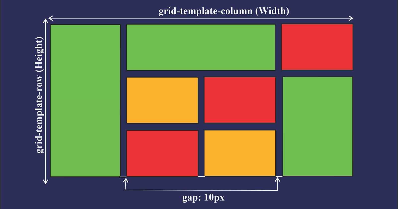
🟣Properties for grid container
The grid-template-columns property can be used to specify the width of columns.
 .container{
            display: grid;
            grid-template-columns: 80px 120px auto;
 }
The grid-template-row property can be used to specify the height of each row.
  .container{
            display: grid;
            grid-template-rows : 80px 120px auto;
 }
The justify-content property is used to align the whole grid inside the container.
The align-content property is used to vertically align the whole grid inside the container.
🟣Properties for grid items:
The grid-column property defines how many columns an item will span.
 .grid-item{
            grid-column:1/5;
        }
The grid-row property defines how many rows an item will span.
We can make an item to start on column 1 and span 3 columns like this:
 .item{
       grid-column:1/span 3;
   }
Rest of these properties there are so many properties provided by CSS Grid.
For better understanding, you can try with yourself.
THANK YOU :)